Letters That Climb Like Mountains
Today we dive into Topographic Typography: Letterforms Inspired by Mountain Contours, exploring how elevation lines, ridges, and valleys can shape strokes, counters, spacing, and rhythm. Expect practical methods, field notes from sketching above treeline, digital techniques for precision, and stories that connect cartographic care with typographic nuance. Bring curiosity, sturdy shoes, and a sketchbook; we’ll translate landscapes into alphabets with clarity, respect, and adventurous craft.
Reading the Land to Draw the Line
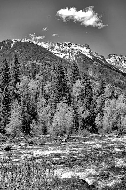
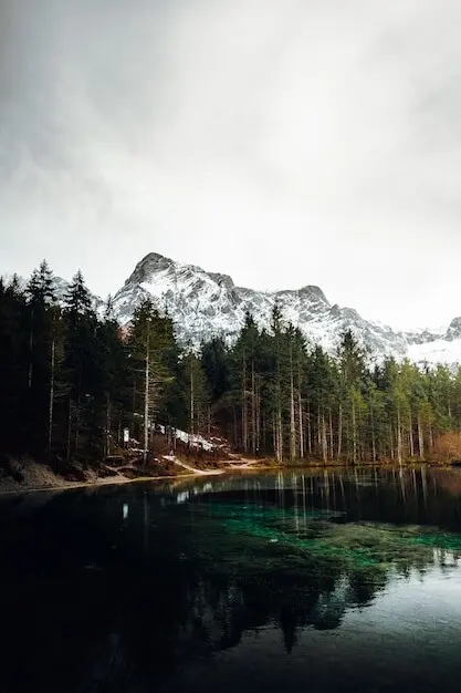
Before tracing elegant strokes, understand how contour intervals describe slope, aspect, and relief. Learning to read dense nestings, saddles, and spurs clarifies where letters crave modulation, where quiet rests are needed, and where dramatic contrast feels truthful. Observation outdoors primes design decisions later at the desk.
From Field Sketch to Vector Precision
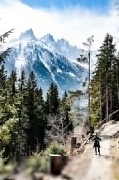
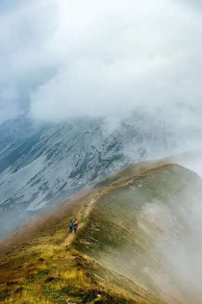
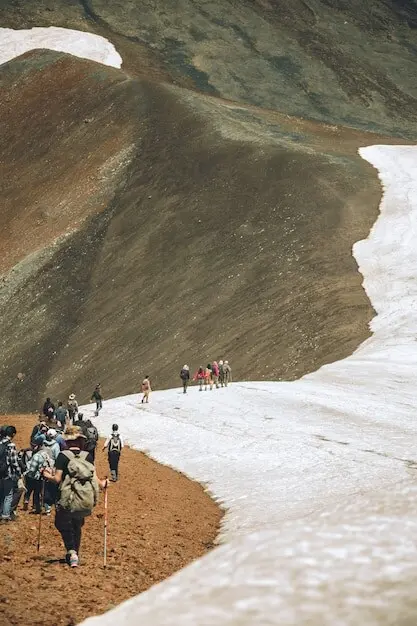
Slip a waterproof notebook, 4B pencil, fine-liner, compass, inclinometer app, and compact binoculars beside snacks and a lightweight tarp. Not to cosplay cartographer, but to notice. Tools provoke questions: how steep, which aspect, what texture? Curiosity, not gear, draws the most honest lines.
When digitizing, resist auto-trace shortcuts. Plot anchor points where form changes direction, align handles with imagined slopes, and vary tension to echo terrain energy. Name layers clearly, document contour sources, and keep a reference map open to guard against aesthetic choices that misrepresent geography.
Print proofs, pin them beside trail sketches, and walk backward across the room. Small sizes will devour fragile hairlines; headlines may beg for bolder ridges. Adjust overshoots and spacing until letterforms stride confidently, never tripping on overdecorated edges or slippery, directionless valleys.
Texture, Contrast, and Ink Behavior
Topographic ideas meet physical realities in print. Line density, trapping, and dot gain can bury delicate relief or exaggerate shadows. Choose processes thoughtfully: risograph coaxes grainy fog, letterpress embosses subtle ridges, offset rewards crisp micro-contrast. Calibrate inks and papers so terrain remains evocative, not muddy.
Digital Motion and Interactive Relief
Screens invite living maps within letters. Variable fonts can morph stroke density like shifting contour intervals, while WebGL or Canvas shaders simulate parallax over counters. Tilt sensors, scroll depth, and timed easing suggest ascent without nausea. Always prioritize performance, restraint, and content clarity over clever effects.
Beyond weight and width, consider an axis controlling contour congestion: more lines for banners, fewer for small text. Tie interpolation to scroll or time with gentle curves, and provide user controls. Remember motion sickness thresholds and prefers-reduced-motion; accessibility is part of responsible mountain stewardship.
SVG masks, blend modes, and variable font features can adapt detail as breakpoints change. On narrow screens, reduce contour density and space letters slightly wider to avoid moiré. On large displays, introduce subtle ridge textures only after content loads, preserving speed budgets and reading comfort.
History, Precedents, and Inspiring Trails
Cartography and lettering have danced for centuries. Eduard Imhof’s luminous relief taught generations to respect terrain. Psychedelic posters in the late 1960s bent lines into vibrating alphabets. Contemporary studios remix GIS with calligraphy. Studying these paths protects you from clichés while widening your creative courage.
Cartographers Who Drew With Music
Imhof balanced chroma like chords, allowing contours, shading, and labels to harmonize rather than compete. His discipline models how expressive typography can still serve clarity. Seek also Japanese relief masters and Soviet school atlases; varied traditions enrich your palette and sharpen ethical sensitivity.
Counterculture Posters and Lines
Bay Area printers twisted topographic curls around band names, turning dance halls into imagined mountain ranges. Some aged poorly; others still feel electric. Study spacing, ink traps, and color clashes to learn why. Then borrow spirit, not surface, crafting letters that breathe today’s air.
Brand Systems That Breathe With Altitude
Beyond a headline wordmark, consider patterns, UI widgets, packaging dielines, and motion stingers that share one cartographic logic. Establish do’s for density at sizes, don’ts for illegible overlays, and a vocabulary linking values—steadfast, exploratory, restorative—to visual decisions, so every asset feels like the same mountain weather.
Case Study: Trail Festival Identity
We sketched overlays from the actual course map, aligning headline stems with major ridges and marking aid-station dots as counters. Volunteers navigated easily, sponsors loved the continuity, and users shared photos of bibs beside peak signs. The typography became a mnemonic for the landscape.
Case Study: Brewery With Maps in Its Label
A small brewery anchored labels to nearby watershed contours, pairing malt notes with elevation jokes. We simplified lines for cans, kept denser relief for posters, and built a social map where drinkers pinned favorite overlooks. Sales rose and locals felt respectfully seen rather than tourist-baited.
Challenges, Feedback, and Shared Elevation
Let’s build momentum together. Try small, specific experiments, invite critique, and grow vocabulary for what works. We’ll share prompts, office hours, and reader showcases. Subscribe for workshop dates, reply with field sketches, and suggest trails; this space flourishes when curiosity, generosity, and rigor travel together.